Thursday, 25 June 2015

ASSOCIATION RULE MINING

According to Google Association rule learning is a well researched method for discovering interesting relations between variables in large databases.  For example, the rule \{\mathrm{onions, potatoes}\} \Rightarrow \{\mathrm{burger}\} found in the sales data of a supermarket would indicate that if a customer buys onions and potatoes together, they are likely to also buy hamburger meat.

An Association rule is patter that states when an event occur, another event will occur with certain probability.They are the if/then statements that helps to find the relationship between objects which are frequently used together. For example if a  customer buys milk then he may also buy cereal or if a customer buy tablet or a computer,he may also buy a pen drive or a hard disk.


There are 2 basic criteria that association rule uses 


SUPPORT: The support is sometimes expressed as a percentage of the total number of records in the database.Suppose we have two baskets T1= {A,A,C} ,T2={A,X}, where A,C & X are the item sets, the support count of an item-set is always calculated with respect to the number of transactions which contains the specific items-set. So


  • the absolute support of A, i.e. the absolute number of transactions which contains A, is 2
  • the relative support of A, i.e. the relative number of transactions which contains A, is 22=1
CONFIDENCE: Confidence is defined as the measure of certainty or trustworthiness associated with each discovered pattern.

They are used to identify the relationship and rules generated by analysing for frequently used if/then pattern.

Below is how we calculate Support Confidence and Lift.


For example, if a supermarket database has 100,000 point-of-sale transactions, out of which 2,000 include both items A and B and 800 of these include item C, the association rule "If A and B  are purchased then C is purchased on the same trip" has a support of 800 transactions (alternatively 0.8% = 800/100,000) and a confidence of 40% (=800/2,000). One way to think of support is that it is the probability that a randomly selected transaction from the database will contain all items in the antecedent and the consequent, whereas the confidence is the conditional probability that a randomly selected transaction will include all the items in the consequent given that the transaction includes all the items in the antecedent.
Lift is one more parameter of interest in the association analysis. Lift is nothing but the ratio of Confidence to Expected Confidence. Expected Confidence in this case means, using the above example, "confidence, if buying A and B does not enhance the probability of buying C."  It is the number of transactions that include the consequent  divided by the total number of transactions. Suppose the number of total number of transactions for C are 5,000. Thus Expected Confidence is 5,000/1,00,000=5%. For our supermarket example the Lift = Confidence/Expected Confidence = 40%/5% = 8. Hence Lift is a value that  gives us information about the increase in probability of the "then" (consequent)  given the "if" (antecedent) part.
A lift ratio larger than 1.0 implies that the relationship between the antecedent and the consequent is more significant than would be expected if the two sets were independent. The larger the lift ratio, the more significant the association.
In the Next article will explain how to do it with R.

Monday, 1 June 2015

LOGISTIC REGRESSION using R

LOGISTIC REGRESSION 

Before doing  Logistic regression, one should be clear about what "odds" are, and interpretation of it.
When you see on a screen , that the odds for a particular team A are  6 to 1 , this means that the team is expected to win 1 and lose 6. If we see the probability, the probability of wining is 1/7 . But the odds for winning is 1/6 = 0.17 Odds are the ratio of two probability

          p(one outcome)       p(success)    p
odds = -------------------- = ----------- = ---, where q = 1 - p
       p(the other outcome)    p(failure)    q

So, odds(winning) = (1/7)/(6/7) = 1/6

Suppose in the same match Team B is given odds of 2 to 1, which is to say, two expected loses for each expected win. Team B's odds of winning are 1/2, or 0.5. How much better is this than the winning odds for Team A?

 The odds ratio tells us: 0.5 / 0.17 = ~3. The odds of Team B winning are three times the odds of Team A winning. Be careful not to say "times as likely to win," which would not be correct. The probability (likelihood, chance) of Team B winning is 1/3 and for Team A is 1/7, resulting in a likelihood ratio of 2.36 .Team B is 2.36 times more likely to win than is Team A.

Logistic regression is a method for fitting a regression curve, y = f(x), when y consists of proportions or probabilities, or binary coded (0,1--failure,success) data. When the response is a binary (dichotomous) variable, and x is numerical, logistic regression fits a logistic curve to the relationship between x and y.Hence, logistic regression is linear regression on the logit transform of y, where y is the proportion (or probability) of success at each value of x.

We will work on a dataset where we will be interested in  how variables, such as GRE (Graduate Record Exam scores), GPA (grade point average) and prestige of the undergraduate institution, effect admission into graduate school. The response variable, admit/don't admit, is a binary variable.

> Data <- read.csv("C:/Users/shubham/Downloads/binary.csv")
> head(Data)
  admit gre  gpa rank
     0    380 3.61    3
     1    660 3.67    3
     1    800 4.00    1
     1    640 3.19    4
     0    520 2.93    4
     1    760 3.00    2

> summary(Data)
     admit             gre                      gpa                 rank      
 Min.   :0.0000     Min.   :220.0       Min.   :2.260      Min.   :1.000  
 1st Qu.:0.0000    1st Qu.:520.0     1st Qu.:3.130     1st Qu.:2.000  
 Median :0.0000   Median :580.0    Median :3.395    Median :2.000  
 Mean   :0.3175    Mean   :587.7    Mean   :3.390     Mean   :2.485  
 3rd Qu.:1.0000    3rd Qu.:660.0    3rd Qu.:3.670      3rd Qu.:3.000  
 Max.   :1.0000     Max.   :800.0     Max.   :4.000      Max.   :4.000 

> sapply(Data,sd)
      admit         gre                   gpa            rank 
  0.4660867   115.5165364   0.3805668   0.9444602 

> xtabs(~admit+rank, data=Data)
              rank
admit  1  2  3  4
    0   28 97 93 55
    1   33 54 28 12

Dataset has been loaded with the command "read.csv" , then the "head()" function is used to see the first six observation ,our target variable is "admit" which dichotomous in nature were 0 means not admitted and 1 means admitted, we are taking "gpa" and "gre" as continuous variable and "rank" as categorical variable with 4 levels from Rank 1 to Rank 4 , where  Institutions with a rank of 1 have the highest prestige, while those with a rank of 4 have the lowest. We can also use "tail()" to see the last 6 observations. Summary of the dataset is obtained using "summary()" command and then standard deviation of the variables using "sapply()" function , and later we have made contingency table 

> str(Data)
'data.frame': 400 obs. of  4 variables:
 $ admit: int  0 1 1 1 0 1 1 0 1 0 ...
 $ gre  : int  380 660 800 640 520 760 560 400 540 700 ...
 $ gpa  : num  3.61 3.67 4 3.19 2.93 3 2.98 3.08 3.39 3.92 ...
 $ rank : int  3 3 1 4 4 2 1 2 3 2 ...

> Data$rank=as.factor(Data$rank)

If we take a look at the above output given by "str()" function, we can see that the Rank is being treated as integer. to make it categorical, it has been converted into factors using function "as.factor".
Now we are ready to estimate the logistic regression model , we can do it using "glm()" function

> logit=glm(admit~., data=Data)
> summary(logit)
Call:
glm(formula = admit ~ gre + gpa + rank, data = Data)

Deviance Residuals: 
    Min       1Q   Median       3Q      Max  
-0.7022  -0.3288  -0.1922   0.4952   0.9093  

Coefficients:
              Estimate Std. Error t value Pr(>|t|)    
(Intercept) -0.2589102  0.2159904  -1.199   0.2314    
gre             0.0004296  0.0002107   2.038   0.0422 *  
gpa            0.1555350  0.0639618   2.432   0.0155 *  
rank2        -0.1623653  0.0677145  -2.398   0.0170 *  
rank3        -0.2905705  0.0702453  -4.137 4.31e-05 ***
rank4        -0.3230264  0.0793164  -4.073 5.62e-05 ***
---
Signif. codes:  0 ‘***’ 0.001 ‘**’ 0.01 ‘*’ 0.05 ‘.’ 0.1 ‘ ’ 1

(Dispersion parameter for gaussian family taken to be 0.1979062)

    Null deviance: 86.677  on 399  degrees of freedom
Residual deviance: 77.975  on 394  degrees of freedom
AIC: 495.12

Number of Fisher Scoring iterations: 2

Above,"glm()" is used to fit the model with "admit" as our response variable.We can see that Both gre and gpa are statistically significant, as are the three terms for rank. The logistic regression coefficients give the change in the log odds of the outcome for a one unit increase in the predictor variable.
  • For every one unit change in gre, the log odds of admission (versus non-admission) increases by 0.0004.
  • For a one unit increase in gpa, the log odds of being admitted to graduate school increases by 0.156.
  • The indicator variables for rank have a slightly different interpretation. For example, having attended an undergraduate institution with rank of 2, versus an institution with a rank of 1, changes the log odds of admission by -0.16
Below the table of coefficients are fit indices, including the null and deviance residuals and the AIC.
But what does actually null and deviance residuals mean?
Let LL = loglikelihood
Here is a quick summary of what you see from the summary(glm.fit) output,
Null Deviance = 2(LL(Saturated Model) - LL(Null Model)) on df = df_Sat - df_Null
Residual Deviance = 2(LL(Saturated Model) - LL(Proposed Model)) df = df_Sat - df_Res
The Saturated Model is a model that assumes each data point has its own parameters (which means you have n parameters to estimate.).The Null Model assumes the exact "opposite", in that is assumes one parameter for all of the data points, which means you only estimate 1 parameter.The Proposed Model assumes you can explain your data points with p parameters + an intercept term, so you have p+1 parameters.If your Null Deviance is really small, it means that the Null Model explains the data pretty well. Likewise with your Residual Deviance.
What does really small mean? If your model is "good" then your Deviance is approx Chi^2 with (df_sat - df_model) degrees of freedom.If you want to compare you Null model with your Proposed model, then you can look at
(Null Deviance - Residual Deviance) approx Chi^2 with df Proposed - df Null = (n-(p+1))-(n-1)=p

Now we would like to test the overall effect of Rank. we can do it by Wald Test . But before that install package "aod" in R.

> wald.test(b=coef(logit), Sigma=vcov(logit),Terms=4:6)
Wald test:
----------

Chi-squared test:
X2 = 23.2, df = 3, P(> X2) = 3.8e-05

In wald.test function "b"supplies the coefficients, while "Sigma" supplies the variance covariance matrix of the error terms, finallyTerms tells R which terms in the model are to be tested, in this case, terms 4, 5, and 6, are the three terms for the levels ofrankThe chi-squared test statistic of 23.2, with three degrees of freedom is associated with a p-value of 3.8e-05 indicating that the overall effect of rank is statistically significant.

Now we will predict the probability of admission at each value of rank, holding gre and gpa at their means. First we create and view the data frame.

>newdata=with(mydata, data.frame(gre = mean(gre), gpa = mean(gpa), rank = factor(1:4)))
>newdata
     gre     gpa     rank
1 587.7 3.3899    1
2 587.7 3.3899    2
3 587.7 3.3899    3
4 587.7 3.3899    4

>newdata$rankP <- predict(logit, newdata = newdata, type = "response")
>newdata
    gre    gpa rank     rankP
1 587.7 3.3899    1 0.5207974
2 587.7 3.3899    2 0.3584321
3 587.7 3.3899    3 0.2302269
4 587.7 3.3899    4 0.1977710

In the above output we see that the predicted probability of being accepted into a graduate program is 0.52 for students from the highest prestige undergraduate institutions (rank=1), and 0.18 for students from the lowest ranked institutions (rank=4), holding greand gpa at their means, like wise we can predict the probability of any required gpa and gre.

Tuesday, 26 May 2015

TIME SERIES using R

FITTING  ARIMA MODEL in R

Auto Regressive Integrated Moving Average ( ARIMA) model is generalisation of  Auto Regressive Moving Average Model (ARMA) and used to predict future points in Time series.
But what is time series , Acc to google "time series is a sequence of data points, typically consisting of successive measurements made over a time interval. Examples of time series are ocean tides, counts of sunspots, and the daily closing value of the Dow Jones Industrial Average." and more in a general way it is a series of values of a quantity obtained at successive times, often with equal intervals between them.

ARIMA models are defined for stationary time series , stationary time series is one whose mean, variance, autocorrelation are all constant over time. But for checking that the time series is stationary or not , we have several statistical tests for them namely.

1) For the Box.test, if p-value < 0.05 => stationary
2) For the adf.test, if p-value < 0.05 => stationary
3) For the kpss.test, if p-value > 0.05 => stationary
We will use time series data on the age of death of successive kings of England, starting with William the Conqueror.We will load the data in R and see the plot
> kings <- scan("http://robjhyndman.com/tsdldata/misc/kings.dat",skip=3)
> plot.ts(kings)

Now we check whether the time series is stationary or not using our statistical test.

> kpss.test(kings)


KPSS Test for Level Stationarity

data:  kings
KPSS Level = 0.6906, Truncation lag parameter = 1, p-value = 0.0144


> adf.test(skirts)
  Augmented Dickey-Fuller Test

data:  kings
Dickey-Fuller = -2.1132, Lag order = 3, p-value = 0.529
alternative hypothesis: stationary

As we have mentioned before for the kpss test,  p-value should be greater than 0.05 for a time series to be stationary , but whereas in our case it is the opposite which suggests that it is not stationary.

Also with the adf.test that we have performed above ,the p-value is greater than 0.05 whereas it should be less than 0.05 for a stationary time series. Also we can look at the plot of the data and as according to stationary definition mean , variance etc should be constant over time which is not.

Thus here we concluded that the time series is not stationary and we cannot use ARIMA  on this , but don't worry its not the end. 
Now we will difference the time series until we obtain a stationary time series.But what does differencing mean?. The first difference of a time series is the series of changes from one period to the next. If Yt denotes the value of the time series Y at period t, then the first difference of Y at period t is equal to Yt-Yt-1.Now we will difference the time series.If you have to difference the time series d times to obtain a stationary series, then you have an ARIMA(p,d,q) model, where d is the order of differencing used.
We can use diff() in R to difference the time series

> king_diff=diff(kings, difference=1)
> plot.ts(king_diff)
Now we will check whether this differencing has worked for us to make it stationary or not

> kpss.test(king_diff)

KPSS Test for Level Stationarity

data:  king_diff
KPSS Level = 0.0347, Truncation lag parameter = 1, p-value = 0.1

> adf.test(king_diff)

Augmented Dickey-Fuller Test

data:  king_diff
Dickey-Fuller = -4.0754, Lag order = 3, p-value = 0.01654
alternative hypothesis: stationary

The above tests gives us the positive results. the p-value of kpss.test is greater than 0.05 and for adf.test it is less than 0.05 , hence suggesting us the time series is now stationary.Since we have differenced the series by 1, an ARIMA(p,1,q) model is probably appropriate for the time series of the age of death of the kings of England.

Now we have made our time series stationary, its time to select appropriate ARIMA model , which means finding the values of most appropriate values of p and q for an ARIMA(p,d,q) model. To do this, you usually need to examine the correlogram and partial correlogram of the stationary time series. First we will see the acf plot.

>acf(king_diff)


> acf(king_diff, plot=F)
     0      1              2         3       4          5         6        7          8         9         10      11     12 
 1.000 -0.360 -0.162 -0.050  0.227 -0.042 -0.181  0.095  0.064 -0.116 -0.071  0.206 -0.017 
    13        14      15      16 
-0.212  0.130  0.114 -0.009 

We see from the correlogram that the autocorrelation at lag 1 (-0.360) exceeds the significance bounds, but all other autocorrelations between lags 1-15 do not exceed the significance bounds
Now we see the pacf  plot

> pacf(king_diff)

> pacf(king_diff, plot=F) 
     1         2         3         4           5         6          7        8          9      10         11     12     13 
-0.360 -0.335 -0.321  0.005  0.025 -0.144 -0.022 -0.007 -0.143 -0.167  0.065  0.034 -0.161 
    14      15        16 
 0.036  0.066  0.081 

The partial correlogram shows that the partial autocorrelations at lags 1, 2 and 3 exceed the significance bounds, are negative, and are slowly decreasing in magnitude with increasing lag (lag 1: -0.360, lag 2: -0.335, lag 3:-0.321). The partial autocorrelations tail off to zero after lag 3.
Since the Corrlelogram is 0 after lag 1 and the partial correlelogram tails of to 0 after lag 3.
Thus we can have ARIMA(3,1,1) model

FORECASTING ARIMA MODEL

Now that we have our ARIMA(3,1,1) model we can forecast the future values with the help of "forecast" package.

> king_arima=arima(kings, order=c(3,1,1))

> king_forecast=forecast.Arima(king_arima, h=3)

   Point Forecast    Lo 80    Hi 80    Lo 95     Hi 95
43       64.79235 45.69668 83.88803 35.58804  93.99667
44       67.48443 46.98649 87.98238 36.13553  98.83334
45       68.43173 47.31180 89.55165 36.13159 100.73186

The original time series for the English kings includes the ages at death of 42 English kings. The forecast.Arima() function gives us a forecast of the age of death of the next 3 English kings (kings 43-45), as well as 80% and 95% prediction intervals for those predictions. The age of death of the 42nd English king was 56 years (the last observed value in our time series), and the ARIMA model gives the forecasted age at death of the next five kings
as 64.8 years.We can also plot the ages, as can be seen below

> plot.forecast(king_forecast)


Monday, 4 May 2015

CLUSTERING WITH R

Today ill show you howto do k-means , k-medoid , Hierarchical and density based clustering in R


K- MEANS CLUSTERING

K-means is one of the simplest unsupervised learning algorithms ,it  aims to partition n observations into k clusters in which each observation belongs to the cluster with the nearest mean. The number of clusters should match the data. An incorrect choice of the number of clusters will invalidate the whole process. An empirical way to find the best number of clusters is to try K-means clustering with different number of clusters and measure the resulting sum of squares.

ADVANTAGES
  • Fast, robust and easier to understand.
  • Relatively efficient: O(tknd), where n is # objects, k is # clusters, d is # dimension of each object, and  is # iterations. Normally, k, t, d << n.
  • Gives best result when data set are distinct or well separated from each other.
 DISADVANTAGE
  • Requires apriori specification of the number of  cluster centers
  • If there are two highly overlapping data then k-means will not be able to resolve that there are two clusters.
  • Fails for categorical data.
  • It uses centroid to represent the cluster therefore unable to handle noisy data and outliers.
  • Algorithm fails for non-linear data set.
  • It does not work well with clusters (in the original data) of Different size and Different density


Now ill show k-means clustering with Iris dataset.


>data(iris)
>str(iris)
'data.frame':  150 obs. of  5 variables:
 $ Sepal.Length: num  5.1 4.9 4.7 4.6 5 5.4 4.6 5 4.4 4.9 ...
 $ Sepal.Width : num  3.5 3 3.2 3.1 3.6 3.9 3.4 3.4 2.9 3.1 ...
 $ Petal.Length: num  1.4 1.4 1.3 1.5 1.4 1.7 1.4 1.5 1.4 1.5 ...
 $ Petal.Width : num  0.2 0.2 0.2 0.2 0.2 0.4 0.3 0.2 0.2 0.1 ...
 $ Species     : Factor w/ 3 levels "setosa","versicolor",..: 1 1 1 1 1 1 1 1 1 1 ...

We’ll remove the Species from the data as we have mentioned it does not work with categorical data

>iris1=iris[,-5]
>head(iris1)
Sepal.Length Sepal.Width Petal.Length Petal.Width
1          5.1         3.5          1.4         0.2
2          4.9         3.0          1.4         0.2
3          4.7         3.2          1.3         0.2
4          4.6         3.1          1.5         0.2
5          5.0         3.6          1.4         0.2
6          5.4         3.9          1.7         0.4

Now we’ll do clustering with iris1 dataset and use the function kmeans()  for it and will be using 3 clusters

>k_mean=kmeans(iris1,3)
>k_mean
K-means clustering with 3 clusters of sizes 96, 21, 33
 
Cluster means:
  Sepal.Length Sepal.Width Petal.Length Petal.Width
1     6.314583    2.895833     4.973958   1.7031250
2     4.738095    2.904762     1.790476   0.3523810
3     5.175758    3.624242     1.472727   0.2727273
 
Clustering vector:
  [1] 3 2 2 2 3 3 3 3 2 2 3 3 2 2 3 3 3 3 3 3 3 3 3 3 2 2 3 3 3 2 2 3 3 3 2 3 3 3 2 3 3 2 2 3 3 2 3 2 3 3 1 1 1 1 1 1
 [57] 1 2 1 1 2 1 1 1 1 1 1 1 1 1 1 1 1 1 1 1 1 1 1 1 1 1 1 1 1 1 1 1 1 1 1 1 1 2 1 1 1 1 2 1 1 1 1 1 1 1 1 1 1 1 1 1
[113] 1 1 1 1 1 1 1 1 1 1 1 1 1 1 1 1 1 1 1 1 1 1 1 1 1 1 1 1 1 1 1 1 1 1 1 1 1 1
 
Within cluster sum of squares by cluster:
[1] 118.651875  17.669524   6.432121
 (between_SS / total_SS =  79.0 %)
 
Available components:
 
[1] "cluster"      "centers"      "totss"        "withinss"     "tot.withinss" "betweenss"    "size"        
[8] "iter"         "ifault"

Now the clustering result is then compared with the class labeled “Species” to check similar objects are grouped together  

>table(iris$Species,k_mean$cluster)
                   1   2    3
  setosa     50   0   0
  versicolor  0 48   2
  virginica    0 14 36

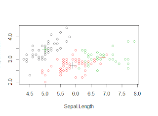
We see that setosa can be easily clustered in one cluster but versicolor and virginica have some amount of overlap. Now we will see graphically .

>plot(iris1[c("Sepal.Length", "Sepal.Width")], col = k_mean$cluster)
>points(k_mean$centers[,c("Sepal.Length", "Sepal.Width")], col = 1:3,pch = 3, cex=2)


 We can see that the black dots are separated as one cluster whereas some of the red and green dots are overlapped as we saw in the table for versicolor and virginica.


K- MEDOID CLUSTERING 


K-medoids clustering uses medoids to represent the cluster rather than centroid. A medoid is the most centrally located data object in a cluster.Here, k data objects are selected randomly as medoids to represent k cluster and remaining all data objects are placed in a cluster having medoid nearest (or most similar) to that data object. After processing all data objects, new medoid is determined which can represent cluster in a better way and the entire process is repeated. Again all data objects are bound to the clusters based on the new medoids. In each iteration, medoids change their location step by step.This process is continued until no any medoid move. As a result, k clusters are found representing a set of n data objects.

We ll show k-medoids clustering with functions pam() and pamk().The k-medoids clustering is more robust than k-means in presence of outliers. PAM (Partitioning Around Medoids) is a classic algorithm for k-medoids clustering. While the PAM algorithm is ine cient for clustering large data, the CLARA algorithm is an enhanced technique of PAM by drawing multiple samples of data, applying PAM on each sample and then returning the best clustering. It performs better than PAM on larger
data

We will "fpc" package for this clustering because in this package it  does not require a user to choose k. Instead, it calls the function pam() or clara() to perform a partitioning around medoids clustering with the number of clusters estimated by optimum average
silhouette width.

I have used the same iris data which was used in the k-means clustering

>medoid=pamk(iris1)
>medoid$nc
[1] 2
>table(medoid$pamobject$clustering,iris$Species)
  setosa versicolor virginica
  1     50          1         0
  2      0         49        50
>layout(matrix(c(1,2),1,2))
>plot(medoid$pamobject)
>layout(matrix(1))


We see that it automatically created 2 clusters.Then we check the cluster against the actual Species.The layout function will will help us to see 2 graphs in one screen then we plot the clusters. We see on the left side the 2 clusters one for the setosa and one is the combination of versicolor and verginica and the red line show us the distance between the two cluster.On the right is the silhouette, In the silhouette, a large Si (almost 1) suggests that the corresponding observations are very well clustered, a small Si (around 0) means that the observation lies between two clusters, and observations with a negative Si are probably placed in the wrong cluster. Since the average Si are respectively 0.81 and 0.62 in the above silhouette, the identified two clusters are well clustered. 
You can also specify the no. of cluster if you are sure.


HIERARCHICAL CLUSTERING 


The hierarchical clustering is a method of cluster analysis which seeks to build a hierarchy of clusters. Strategies for hierarchical clustering generally fall into two types:
  • Agglomerative: This is a "bottom up" approach: each observation starts in its own cluster, an pairs of clusters are merged as one moves up the hierarchy.
  • Divisive: This is a "top down" approach: all observations start in one cluster, and splits are performed recursively as one moves down the hierarchy.
Both this algorithm are exactly reverse of each other.In here ill be covering the Divisive ,the top down approach.
In this example ill use the same iris data.
>hclust=hclust(dist(iris1))
>plot(hclust)
In the above figure we can see that the there we can create 3 clusters , its on us where to cut the line.We can see setosa is easily separated ( in red color box) whereas the vesicolor and verginica are in the next box respectively.
Also we can use first hierarchical clustering to get to know the no.of clusters and then use those no of clusters in the k-means clustering. This is an alternate way to know the k value.


DENSITY - BASED CLUSTERING

The DBSCAN algorithm  from package "fpc" provides a densitybased clustering for numeric data. The idea of density-based clustering is to group objects into one cluster if they are connected to one another by densely populated area. There are two key parameters in DBSCAN :

  • ˆ eps: reachability distance, which defines the size of neighbourhood; and
  • ˆ MinPts: minimum number of points.

If the number of points in the neighbourhood of point is no less than MinPts, then is a dense point. All the points in its neighbourhood are density-reachable from and are put into the same cluster as alpha.The strengths of density-based clustering are that it can discover clusters with various shapes and sizes and is insensitive to noise. As a comparison, the k-means algorithm tends to find clusters with sphere shape and with similar sizes.

In this again we will use same Iris data 

>densityclus<- dbscan(iris1, eps=0.42, MinPts=5)
>table(densityclus$cluster,iris$Species)
     setosa versicolor virginica
  0      2         10           17
  1     48          0           0
  2      0         37           0
  3      0          3           33  

In the above table, "1" to "3" in the rst column are three identi ed clusters, while "0" stands for noises or outliers, i.e., objects that are not assigned to any clusters. The noises are shown as black circles in the figure below.

>plot(densityclus,iris1)
>plotcluster(iris1, densityclus$cluster)

Again we can see satosa in red marked as 1 is clustered cleanly whereas versicolor and verginica there is some overlap (green "2" and blue "3" colour ).